My work at Skillbox English began with a major task: redesigning the product to improve the UI and ensure a consistent UX. Skillbox English is a separate branch within a large educational holding. The design hadn't been updated in several years, and my goal was to create a cohesive UI and UX aligned with the holding's design system. Although the product is part of the Skillbox ecosystem, it has its own design identity, as it was originally a standalone project acquired by Skillbox.
The problem
- Many components were reused but never organized into a cohesive design system.
- Feedback from support indicated significant UX confusion due to UI inconsistencies.
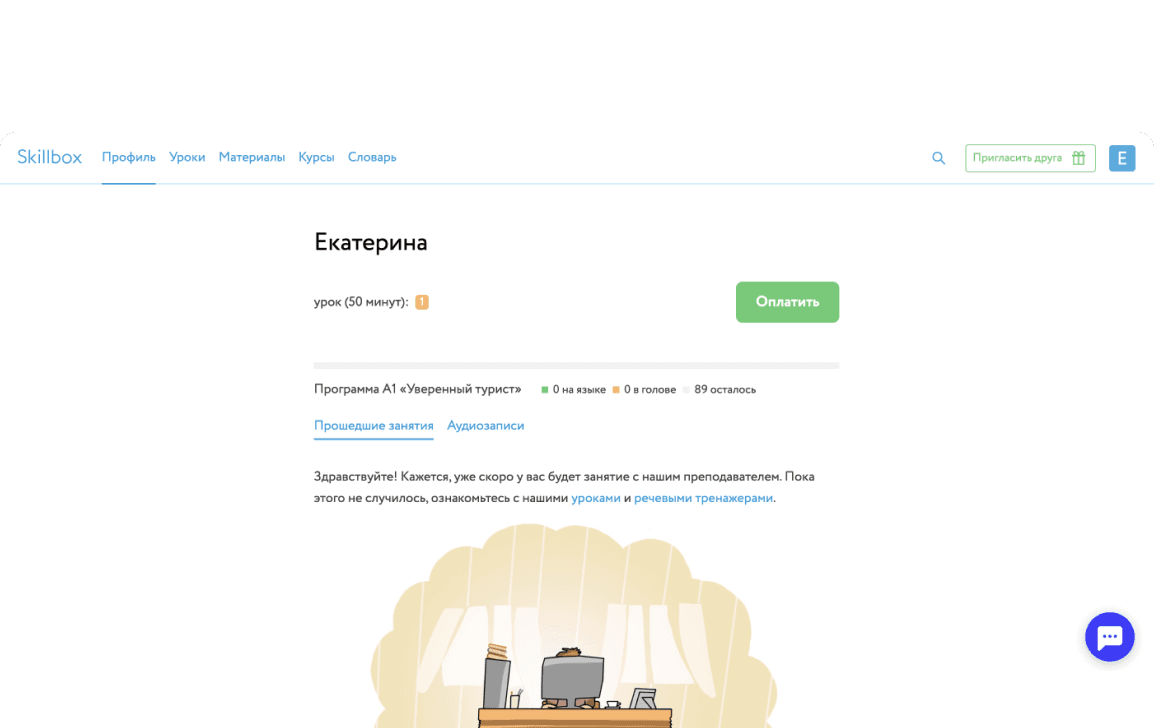
- The overall design felt outdated, especially in areas like the dashboard and lesson materials.
Approach
I integrated the Skillbox English design system with the main Skillbox design system to ensure consistency and continuity across the product. Most of the visual design was developed within the product itself. Given the scale of the updates, which impacted key user flows, we rolled out the visual refresh in several phases.
I conducted research to understand how different user groups interacted with the product. Based on this, I mapped out the most critical parts of the product and created an update roadmap, as we didn't have the resources to overhaul the entire product at once.
Redesigning the dashboard
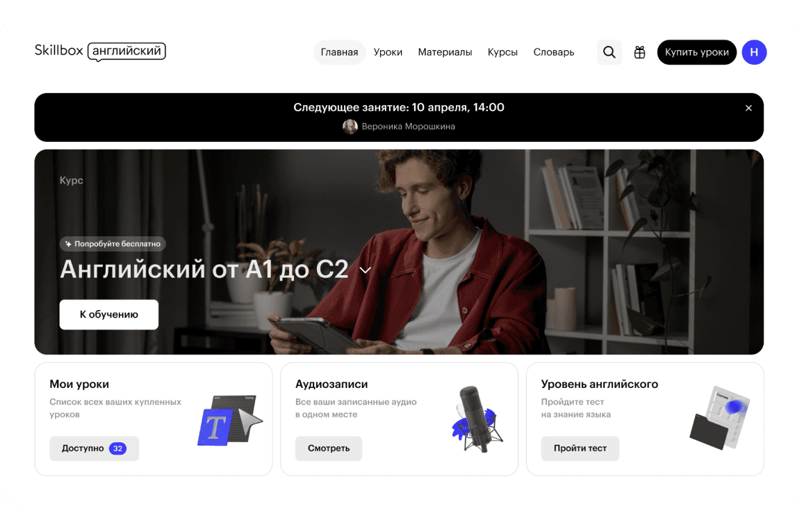
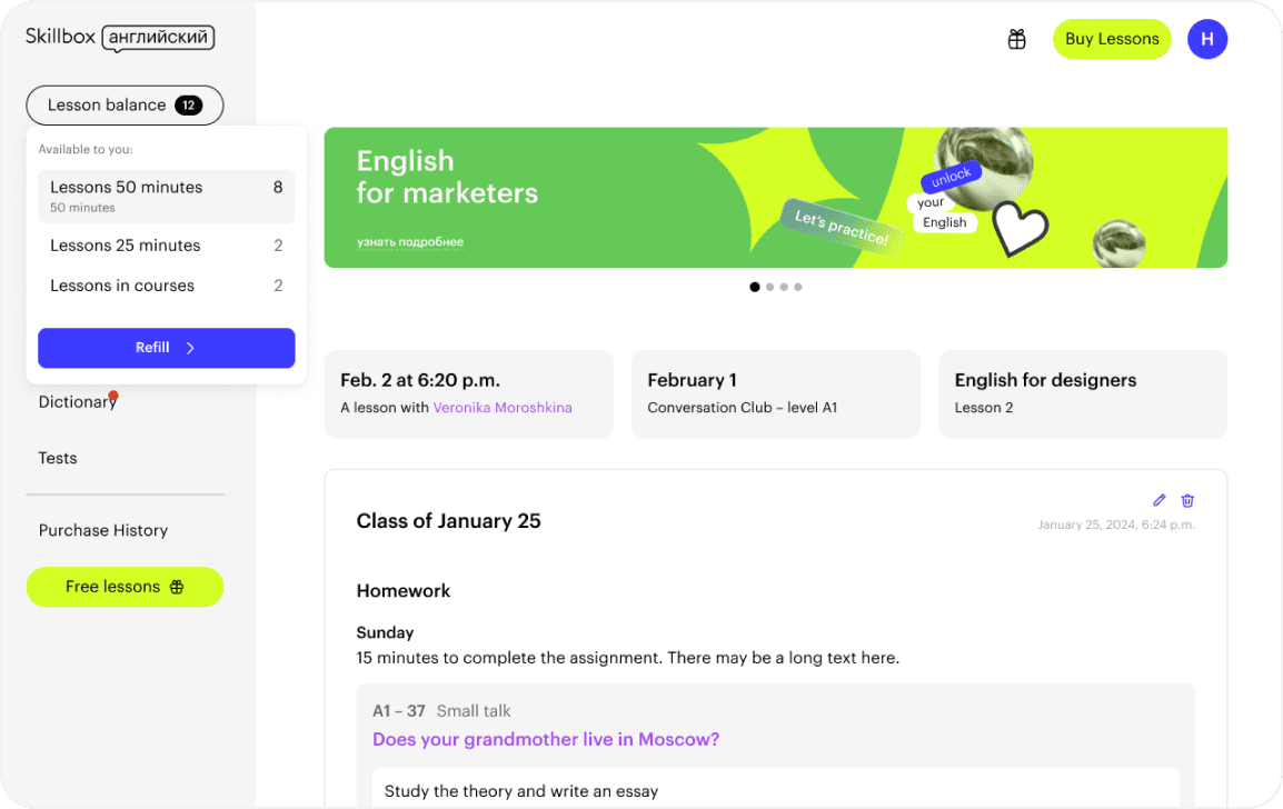
A key part of the update was redesigning the dashboard, which serves as the main user page. I went through several iterations, as sudden, drastic changes could be stressful for one of our main user groups, the teachers. The first iteration focused on updating the UI while keeping the existing functionality intact. After that, we worked with product managers to test various hypotheses, adding and removing features as needed. This process led to a new version that was significantly different from the original.
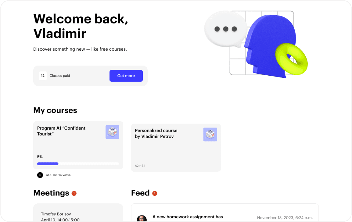
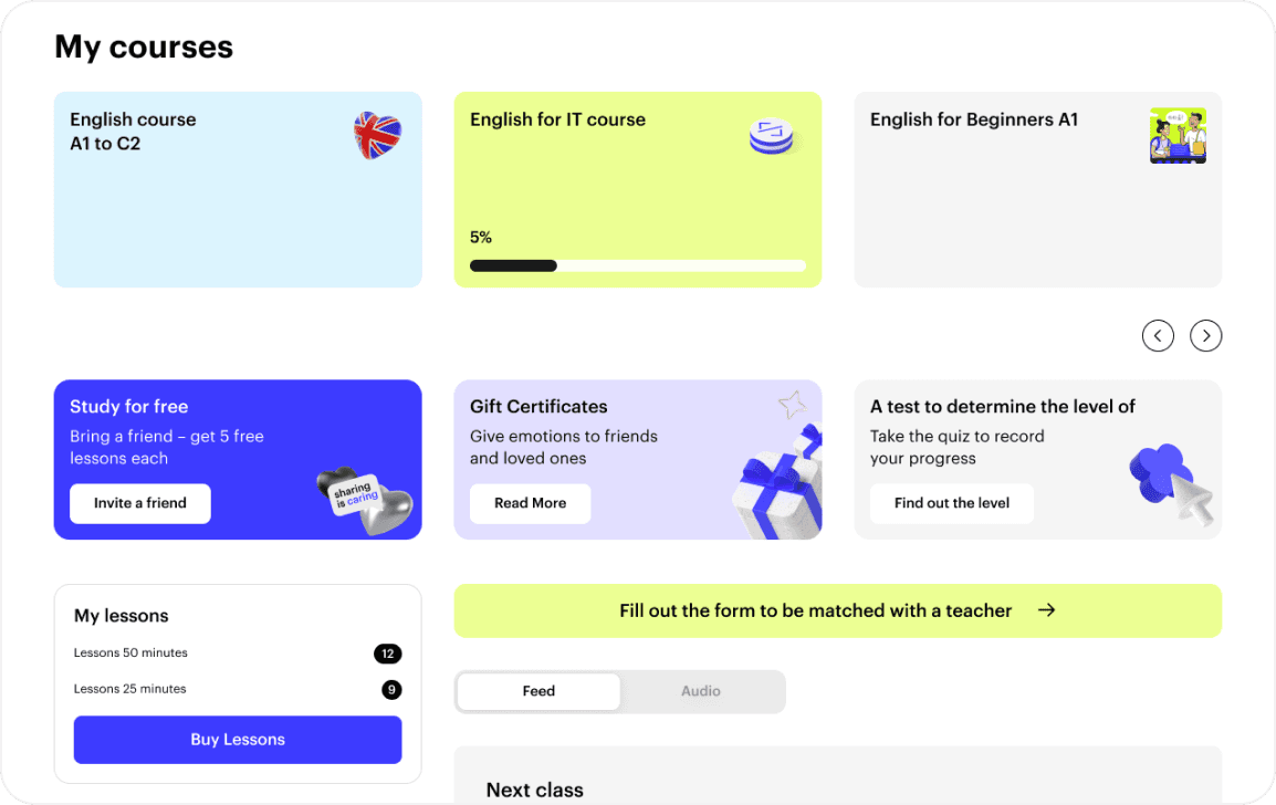
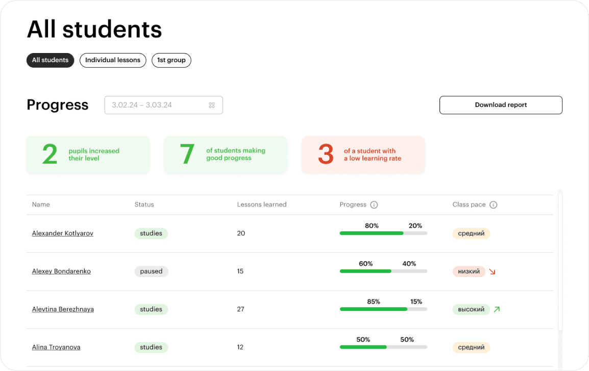
The work on the dashboard is ongoing, because research shows that different user groups interact with the product in various ways. This means we need to customise the start screens based on user roles. Currently, this concept is still in development.
Other key pages
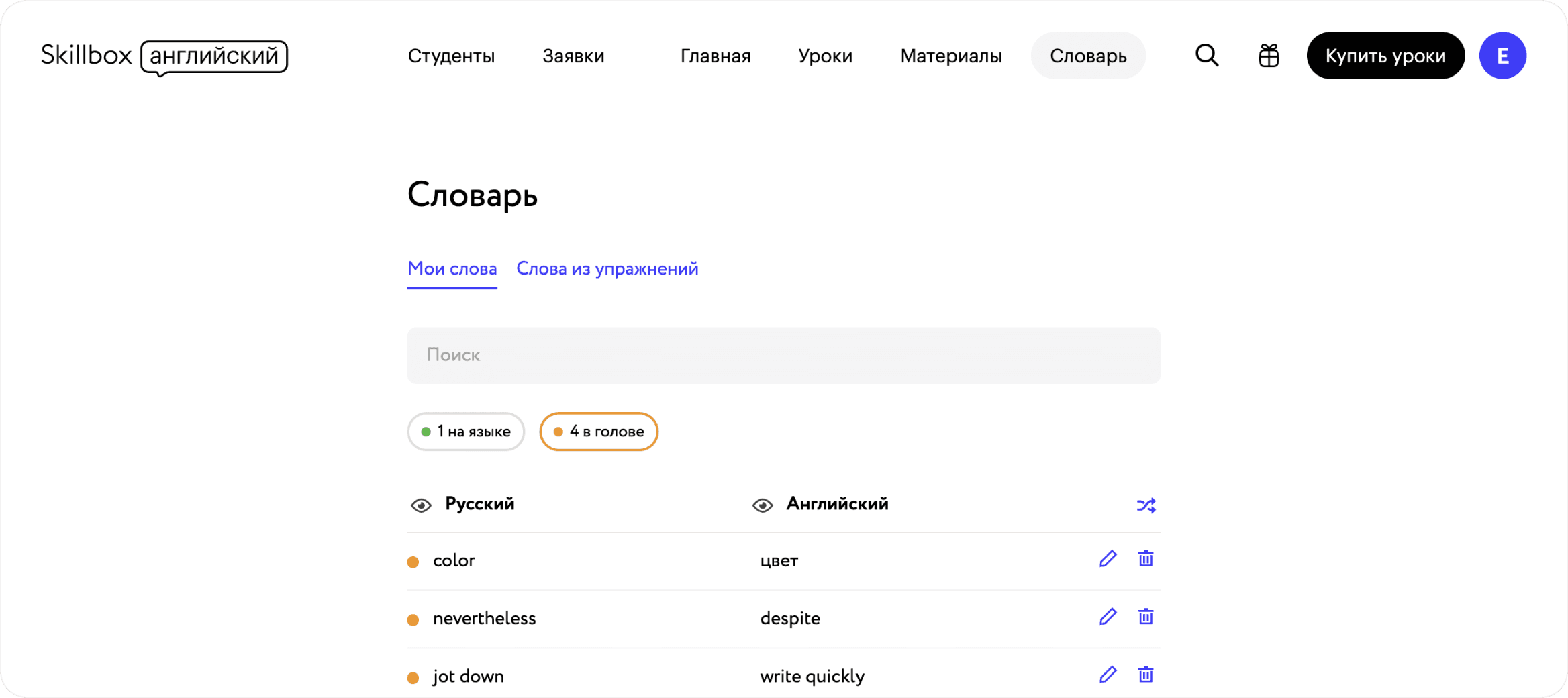
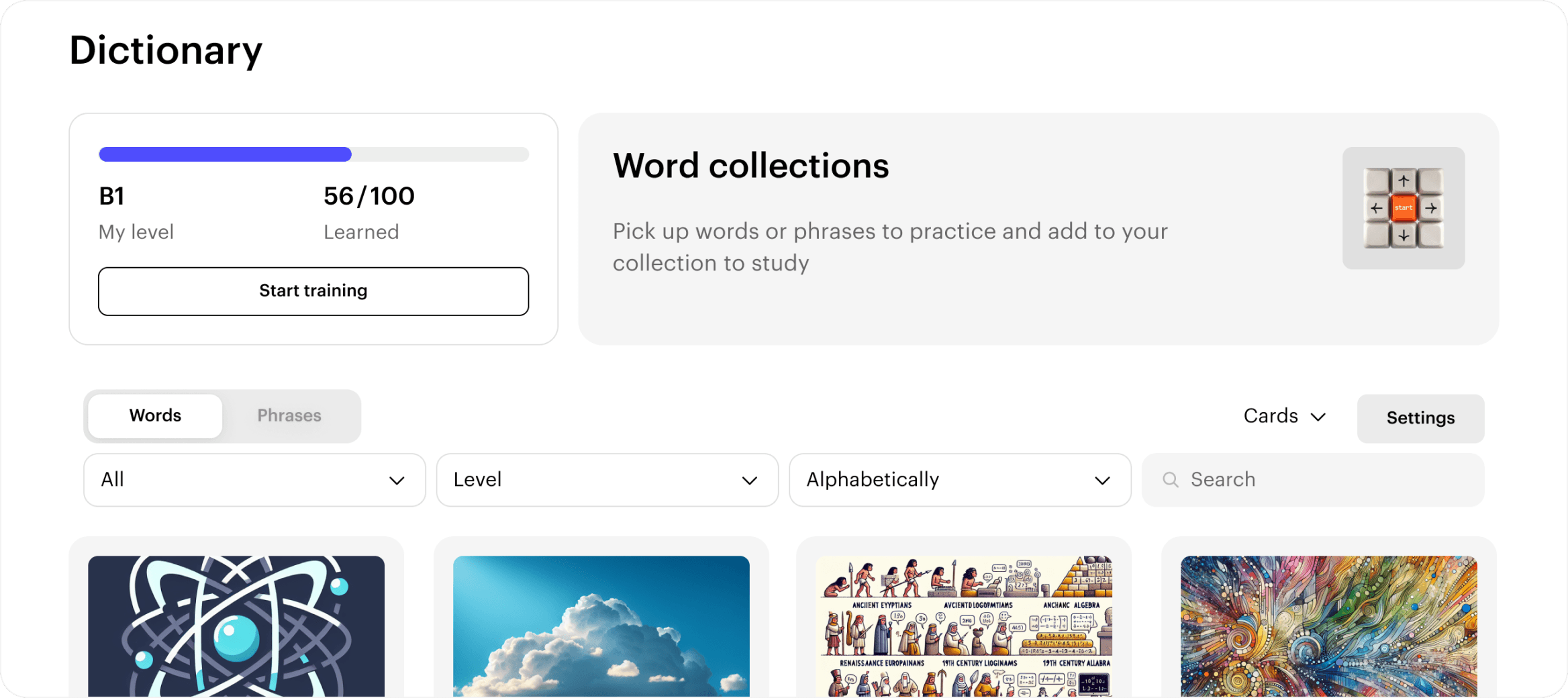
Next, I updated key pages following a similar approach, first addressing the UI and minor UX issues, and then refining the functionality. For instance, here's how the old dictionary page looked and how it has been transformed.